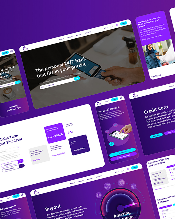
Why Beautiful Interfaces Fail
Without Strategic Experience Design
Pretty screens, poor outcomes.
Build experiences that convert,
retain, and scale.
Shiny UI is easy to praise. Metrics are not. Teams celebrate pixel-perfect visuals, then watch bounce rates, drop-offs, and tickets climb. The gap is simple: interface polish without strategic experience design rarely moves the numbers that matter.
What you will get in this guide:
What strategic experience design actually means
Where beautiful interfaces typically fail, and how to fix the root cause
A practical six-part framework that turns screens into outcomes
A diagnostic checklist you can run this week
KPIs that prove progress, plus a short implementation blueprint
GCC realities for bilingual, multi-market products
Quick FAQ and a Do vs Don’t table you can share with your team
What you need to know
One is how it looks, the other is how it works end to end.
Outcomes beat aesthetics.
Define the job to be done, then design the path that delivers it.
Clarity is a feature.
Microcopy, state handling, and feedback loops drive confidence.
Speed is a feature.
Perceived performance and latency shape trust.
Governance is a feature.
Design systems, analytics, and decision rules keep quality consistent at scale.
Where beautiful interfaces fail
| Symptom |
What users feel |
Root cause |
Strategic fix |
| High drop-off on a polished onboarding |
“Looks nice, not sure what to do” |
No task hierarchy or outcome framing |
Make the first success obvious, one primary action per screen, show progress and time needed |
| Confusing error states in a sleek form |
“It broke, now I am stuck” |
No state design, no recovery path |
Write clear errors, highlight the exact field, offer a safe default and a way back |
| Low mobile conversion on elegant layouts |
“Too much effort on a phone” |
Desktop logic shoved into mobile |
Thumb-zone controls, fewer inputs, wallet options, auto-formatting and autosave |
| Heavy support tickets after launch |
“I cannot finish my task” |
Missing microcopy and guidance |
Add task-based tips, empty-state help, inline FAQs, smarter defaults |
| Pretty dashboards, no decisions |
“Looks rich, says nothing” |
Visuals without narrative |
Add a narrative layer, call out anomalies, put the next action above the fold |
If the screen is pretty but the next step is unclear, the design failed.
1) Outcomes and metrics first
Define the job to be done, the primary user, and the success criteria
Pick three KPIs that prove progress, for example time to value, completion rate, retention
Decide the trade-offs you accept, then hold the line
2) Journey architecture
Map intents, entry points, states, and exits across channels
Design the happy path and the recovery paths in equal detail
Orchestrate web, app, email, and support as one system
Write for decisions, not decoration
Give every component a purpose, a pattern, and an example
Plan bilingual parity from day one, not at the end
Keep a shared glossary so language stays consistent
4) Interaction and performance
Produce Board-ready summaries that keep nuance, not just bullet averages.
5) Accessibility, automatically
Optimize real and perceived speed, skeleton screens and instant feedback help Use microinteractions to confirm actions and reduce anxiety
Respect mobile ergonomics, large targets and short flows win
Trust and accessibility
Clear permissions, clear choices, clear reversals
Accessible colors, sizes, labels, and alt text
Transparent data use, a human route for help
6) Governance and experimentation
One design system, one source of truth
Hypotheses, A or B, then decide on data
Document decisions, patterns, and anti-patterns so teams learn
Before and after, the small things that convert
Checkout button
Before: “Submit”
After: “Pay now”, short note “Next, you get your receipt”
Empty state
Before: blank canvas
After: one line of value, one primary action, one example screenshot
Error state
Before: “Something went wrong”
After: name the issue, show the field, offer the fix, keep input intact
Onboarding
Before: five fields on screen one
After: one promise, two inputs, optional later, show time remaining
Diagnostic checklist you can run this week
Score each item yes or no.
One primary action per screen
First success under two minutes on mobile
Recovery path for every critical error
Microcopy bank and glossary in both languages
Design tokens and patterns respected across teams
Chart captions state what changed and why it matters
Search and navigation work the same across web and app
Accessible color and size checks passed
Analytics events mapped to journey stages
Owners named for each KPI
If you scored fewer than seven yes, you have quick wins.
KPIs that prove design is working
| Area |
Metric |
Target idea |
| Adoption |
Time to first value |
Down week over week |
| Completion |
Task success rate |
Above 80 percent for key flows |
| Efficiency |
Steps per task, mobile |
Fewer steps with equal clarity |
| Support |
Contacts per 1,000 sessions |
Down, no drop in NPS |
| Trust |
Error recovery rate |
Above 60 percent recoveries |
| Performance |
First input delay, LCP, TTFB |
Within lighthouse green |
| Retention |
Day 30 or Month 3 return |
Up and stable |
| Parity |
EN vs AR satisfaction gap |
Less than 10 percent gap |
Build Arabic and English together from the start, mirror logic and spacing, not just words
Respect local payment habits, wallets, cash on delivery, and regional address formats
Align service hours and notifications to local work weeks and holidays
Validate examples and imagery with local teams
Human means culturally precise, not just grammatically correct.
Do and Don’t
| Do |
Don’t |
| Start with outcomes and metrics |
Start with pages and pixels |
| Design states and recovery, not only the happy path |
Hide errors behind generic alerts |
| Write decisive microcopy that guides |
Decorate with vague lines and slang |
| Plan bilingual parity from day one |
Translate at the end and hope it fits |
| Treat speed and accessibility as features |
Leave performance to engineering later |
| Run small tests and ship iteratively |
Save everything for a big reveal |
Implementation blueprint that teams actually follow
Phase 1, Align
Define the job to be done, pick three KPIs, map the journey, agree on constraints, confirm bilingual plan.
Phase 2, Build
Design the happy path and the recovery paths, write microcopy, wire analytics, set performance budgets, create prototypes.
Phase 3, Prove
Ship to a limited audience, watch the KPIs, fix the friction, promote to all users, document the pattern in the system
Keep two gates only, one after alignment, one before full release.
Ready to turn polish into performance
If you want a team that connects UI with strategy , content, speed, accessibility, and analytics, Spark can help. We design experiences that look good and work even better.
Frequently Asked Questions
Is great UI ever enough?
Only when the task is trivial. As complexity rises, journey logic, content, and states determine success.
What is the fastest place to start?
Fix the most expensive drop-off, onboarding or checkout for most products. Cut steps, improve clarity, increase speed.
How do we measure design ROI?
Link KPIs to costs or revenue, completion rate to sales, error recovery to support cost, retention to lifetime value.
Do we need a design system first?
You need a minimal one, tokens, grids, type, components, patterns, then improve it while you ship.


